Golf Pad, founded in 2011, launched a popular GPS and scorekeeping app, now known as Golf Pad GPS. With nearly two million downloads and over forty thousand courses, Golf Pad GPS is used in nearly every country around the world.
MY ROLE
I worked on the redesign of the Golf Pad mobile app across iOS and Android between June 2019 and February 2020. I stopped working on the project during the implementation phase as the app started to be built.
THE CHALLENGE
To evolve with customers and build deeper relationships.
GOALS
- To provide golfers with the tools and knowledge to play their best
- To make the app fast and easy to use for everyone, everywhere
- To create a platform for deeper engagement
- To differentiate the app from competition
- To give golfers more control over their game
DELIVERABLES
- Offered a range of creative insights to improve the accessibility and usability of the application
- Created wireframes, pixel-perfect mockups, and UI images
- Defined the final theme, specs, and guidelines required for implementation
- Prepared design specifications for the development team

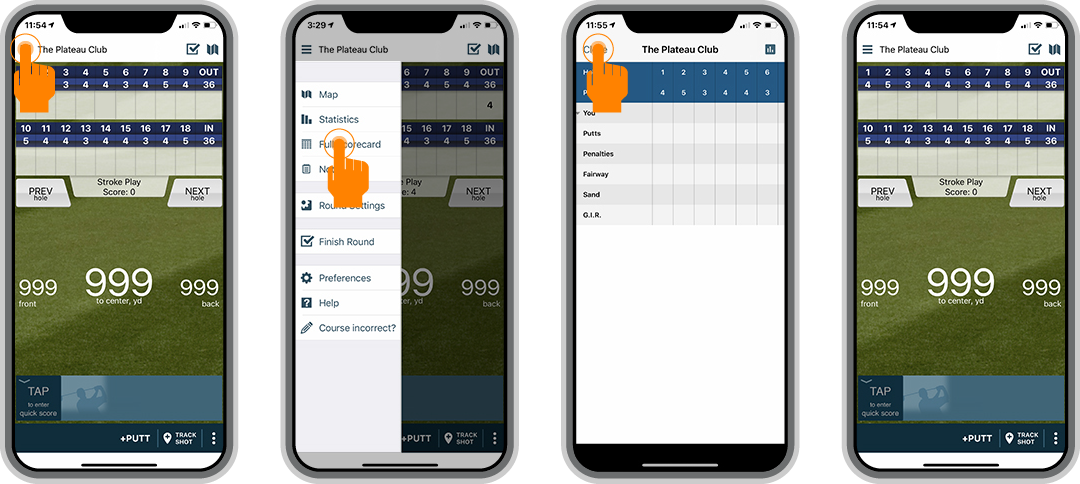
IMPROVING USER ENGAGEMENT
Building a platform that meets users needs, makes the navigation easier, and improves user engagement and trust.
Here is what was added or improved:
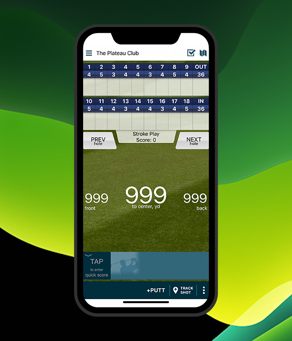
- Distance Display with larger fonts
- Scrollable Menu
- Hole Navigation
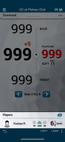
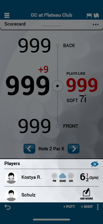
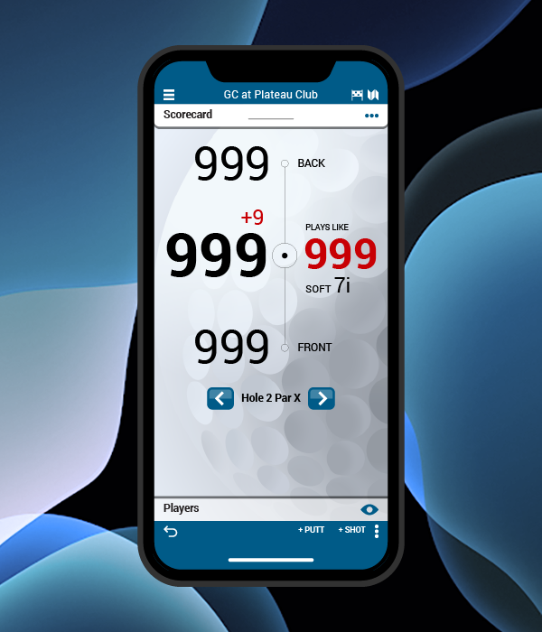
- Plays Like and Club Recommendation
- Shot Tracking information
- Consistency in design and experience
Current Home Page
New Home Page
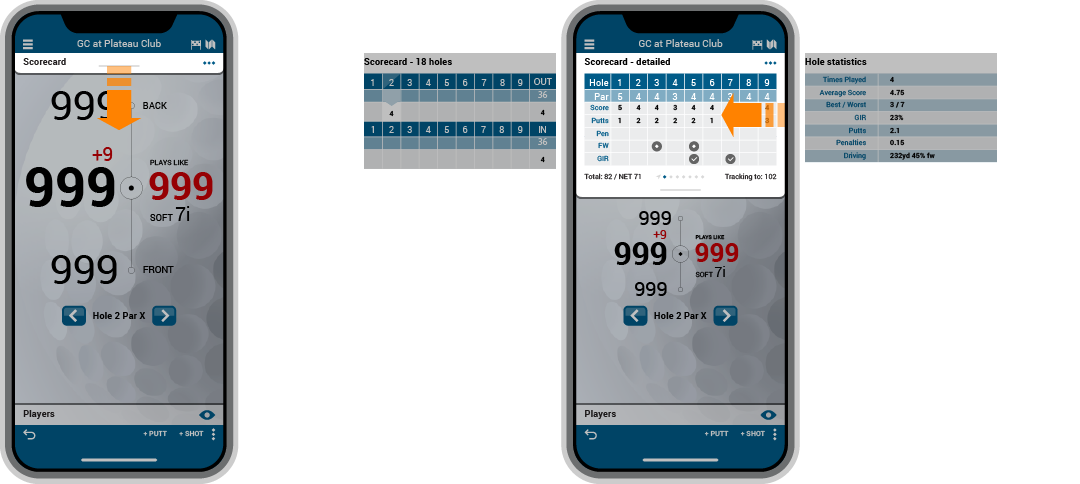
DISTANCE DISPLAY
I used clear sans serif fonts and applied a strong typographic hierarchy to hold more visual weight and help usability. In contrast to the previous design, the new Distance Display is always visible and stretches or shrinks depending on a view.
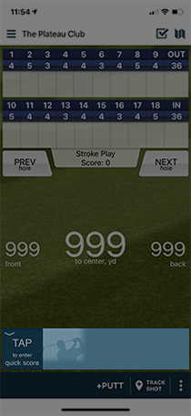
CURRENT VERSION
Distance Display
Distance Display + Side Panel Menu
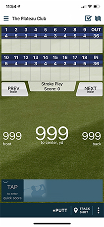
Statistics fully covers Distance Display
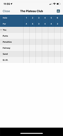
Scorecard fully covers Distance Display
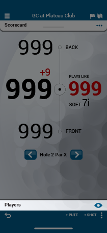
NEW VERSION
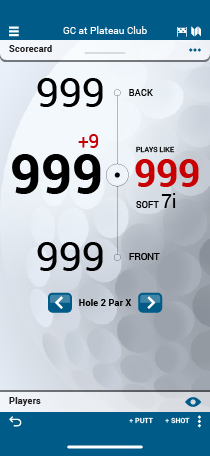
Distance Display
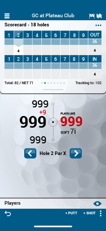
Distance Display + Scorecard
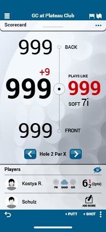
Distance Display + Players
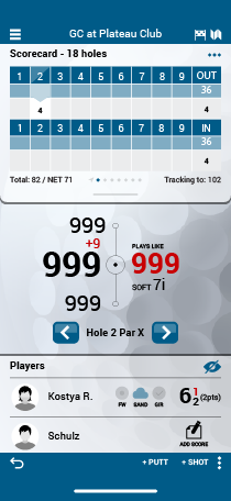
Distance Display + Players + Scorecard